UX Design
portfolio
KENYA ANAIS
DESIGNING FOR THE FUTURE.
Scroll down
Anais Marketing Group
The Project
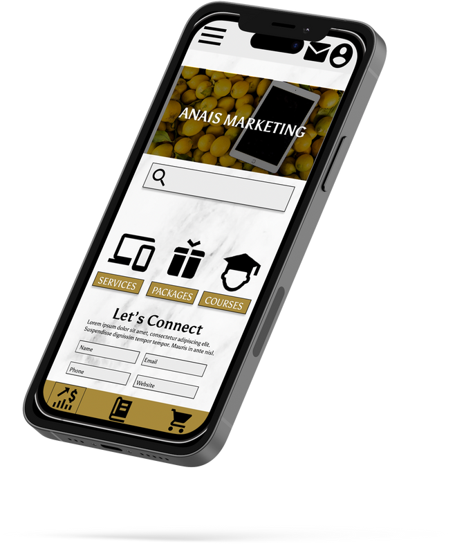
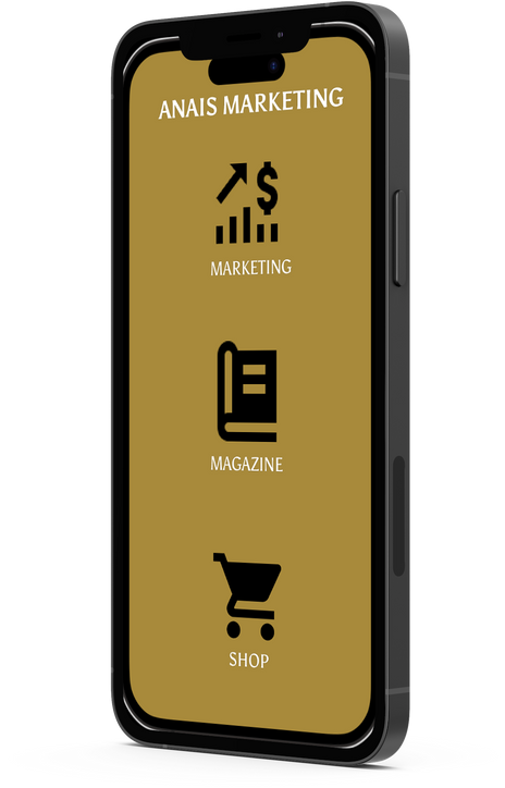
Anais Marketing Group wants to transition to an online marketing agency where we provide a variety of easy-to-purchase marketing services.
Project Duration
September 2022-October 2022
USER PERSONAS
“Business, information, art and creativity- makes me feel creative and excited”
“I want to quit my job and grow my business”
RYLEIGH
Age: 34
Education: Bachelor's Degree
Hometown: Houston, TX
Family: Married, 2 kids
Occupation: Sales Rep
GISELLE
Age: 34
Education: Bachelor's Degree
Hometown: Houston, TX
Family: Married, 2 kids
Occupation: Realtor
GOALS
GOALS
Brand Awareness
Make a Difference
Become a member of a great organization
Support Black-Owned Businesses
Wants to do her art or business full-time
Learn how to build a website or get one built
Host a large networking event
FRUSTRATIONS
FRUSTRATIONS
Costs/Expenses for publicity and marketing
Unprofessional black businesses
Networking and feeling relatable after children
Website prices, difficulty to build
Lack of support for entrepreneurial journey
No idea where to start with marketing
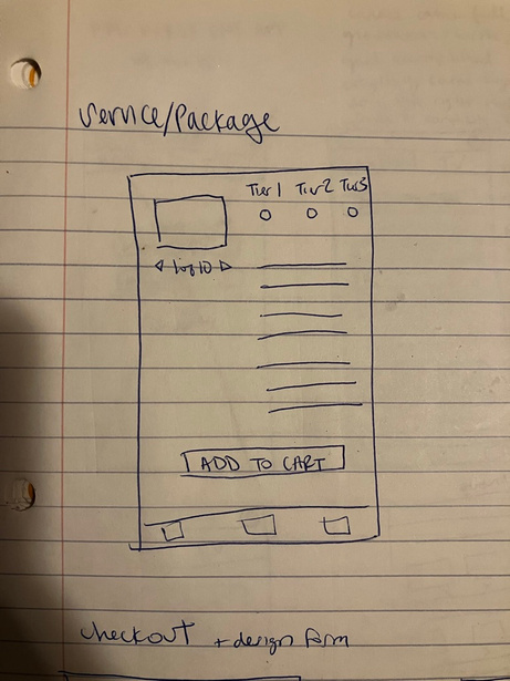
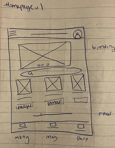
Sketches
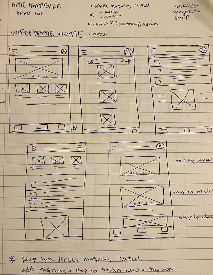
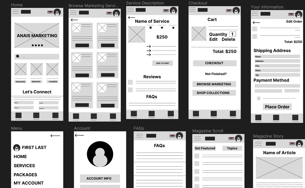
Wireframes


SOLVING USER PAIN POINTS
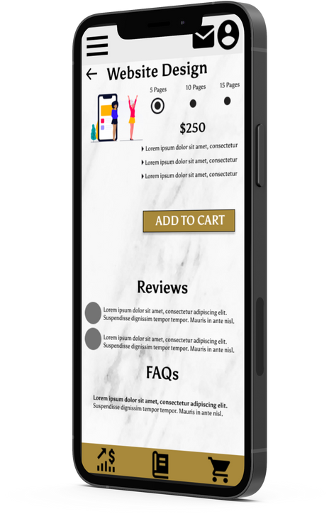
The service tiers help users work within their budget while ensuring they are getting the services they require. In combination with FAQs and reviews, the details of each service tier allow clients to make informed buying decisions.
If you group your elements together they'll stay together in mobile view
Keep scrolling...
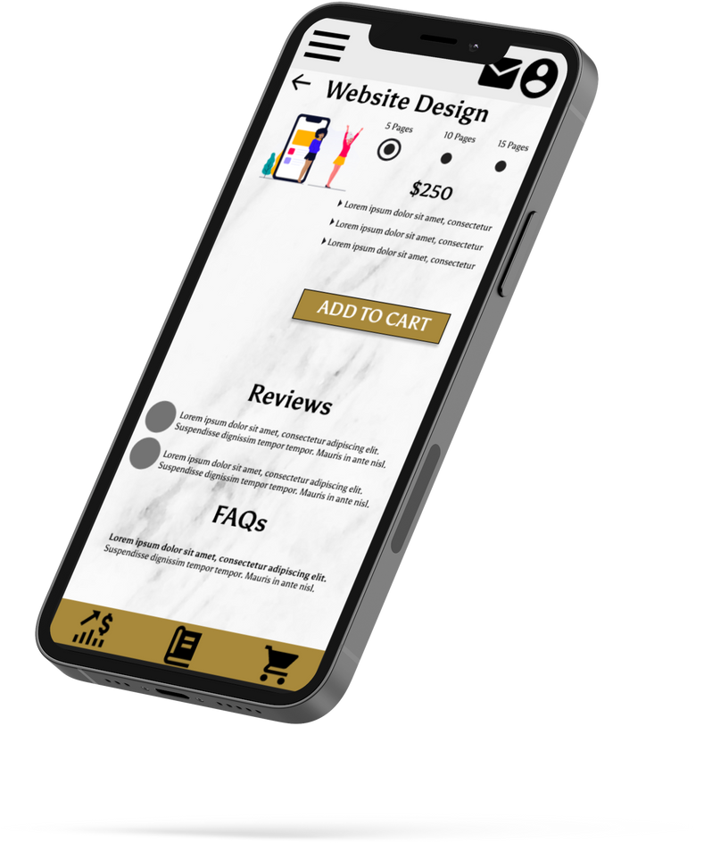
Detailed descriptions of services coupled with commonly asked questions = informed buying decision
Different tiers for each service detailing what is and isn’t included
USABILITY STUDY FINDINGS
01
Easy Call-To-Action
Users want to use images and buttons to navigate through app, they want CTAs to be visible without searching for them.
02
Text & Images
Users would prefer not to read, but instead to see icons or images to represent CTA or message. Users can benefit from larger text and images.
03
Variety
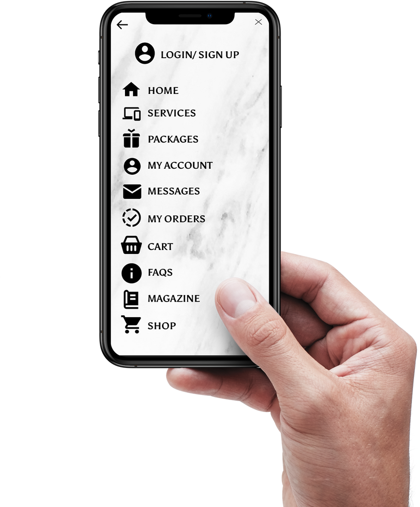
Users like to navigate the app in their own way, prefer variety in how they get to and from an action.
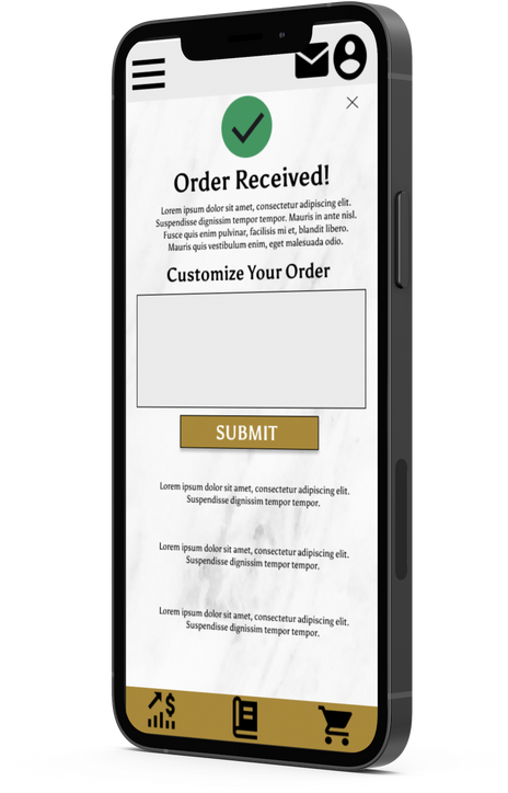
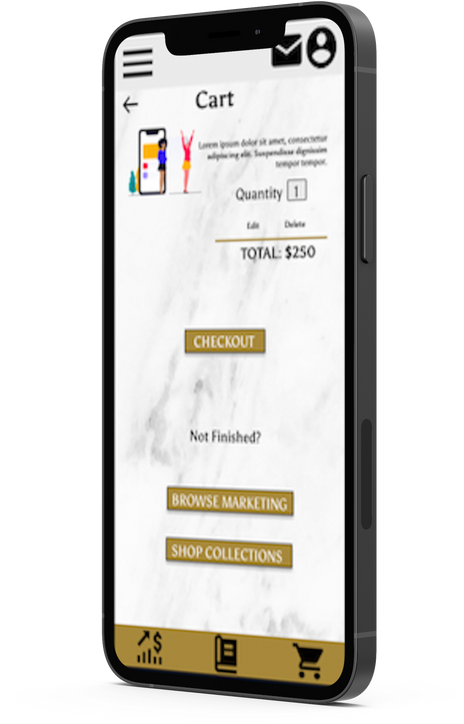
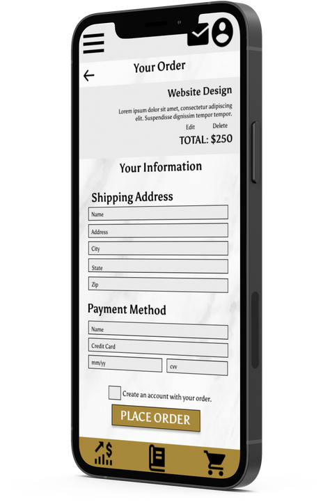
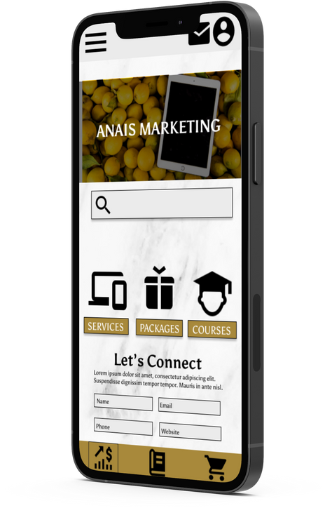
MAIN USER FLOW
ACCESSIBILITY CONSIDERATIONS
01
Size of Text
I spoke with an older user who needs reading glasses. Her major concern was the size of the text so I made most of it larger.
02
High Contrast
Using off white and black with a hint of gold, the app is considering accessibility for visually impaired individuals and everyone in need of very clear CTA’s.
03
More Icons, Less Text
Some users were not very fond of reading or looking for things. This accessibility consideration benefits users who are not proficient in reading, or who choose to be less active for social media.
TAKEAWAYS
1
Impact:
Anais Marketing Group created an app with the user in mind, providing easy-to-purchase marketing services for the aspiring entrepreneur.
2
3
User Quote:
“It was easier than most things on the market.”
What I learned:
While creating the Anais Marketing Group app, I realized that while my initial layout and designs didn’t change drastically, the most important parts of the design came from my iterations after the usability studies.


PPL PXRTY ENTERTAINMENT
The Project
PPL PXRTY ENT. wants a donation-focused website. The goal is to make it easy to donate to and apply for scholarships. The effectiveness of the site will be measured by ease of use and number of donations and applications.
Project Duration
March 2023-May 2023
USER PERSONAS
"Everyone deserves quality education."
"I've got all these gifts to give to the world, but sometimes I feel I was given the short end of the stick."
TONI
Age: 19
Education: HS Diploma
Hometown: New Orleans, LA
Family: Oldest of 3
Occupation: Student/ Artist
TIMOTHY
Age: 51
Education: Master's Degree
Hometown: Austin, TX
Family: Married, 2 kids
Occupation: Retired Scientist
GOALS
GOALS
To master her craft and get paid to do it full-time
To receive financial assistance to fund education and artistic development
To inspire underserved communities to seek higher education
Higher education for all
Help others follow their dreams
FRUSTRATIONS
FRUSTRATIONS
Doesn't know if school is for her
Art school is expensive
Family is not financially able to help her succeed
Hard to get in touch with the communities he wants to reach
Would like to simply write a check to someone deserving
Sketches


Wireframes


SOLVING USER PAIN POINTS
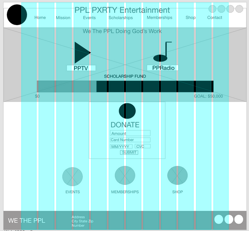
The scholarship fund tracker allows donors to see what their contributing to and monitor the progress of the goal. Donors can easily donate as soon as they reach the site.
If you group your elements together they'll stay together in mobile view
Scroll on...
The fund tracker allows potential donors to see what they are contributing to
Ability to donate on the home page
USABILITY STUDY FINDINGS
01
Easy Call-To-Action
Users want to use images and buttons to navigate through app, they want CTAs to be visible without searching for them.
02
Text & Images
Users would prefer not to read, but instead to see icons or images to represent CTA or message. Users can benefit from larger text and images.
03
Variety
Users like to navigate the app in their own way, prefer variety in how they get to and from an action.
MAIN USER FLOW
The main purpose of the project was to create a donation-focused website. There are 3 different ways to donate, and they all fulfill the same purpose. Funding creatives!
ACCESSIBILITY CONSIDERATIONS
01
Size of Text
I spoke with an older user who needs reading glasses. Her major concern was the size of the text so I made most of it larger.
02
High Contrast
Using off white and black with a hint of gold, the app is considering accessibility for visually impaired individuals and everyone in need of very clear CTA’s.
03
More Icons, Less Text
Some users were not very fond of reading or looking for things. This accessibility consideration benefits users who are not proficient in reading, or who choose to be less active for social media.
TAKEAWAYS
1
Impact:
PPL PXRTY Entertainment received a donation-focused website with the user in mind, providing an easy way for creatives to receive support from generous donors.
2
3
User Quote:
“It was easier than most things on the market.”
What I learned:
While creating the PPL PXRTY website, I realized that while my initial layout and designs didn’t change drastically, the most important parts of the design came from my iterations after the usability studies.

WHAT'S MY DOSHA?
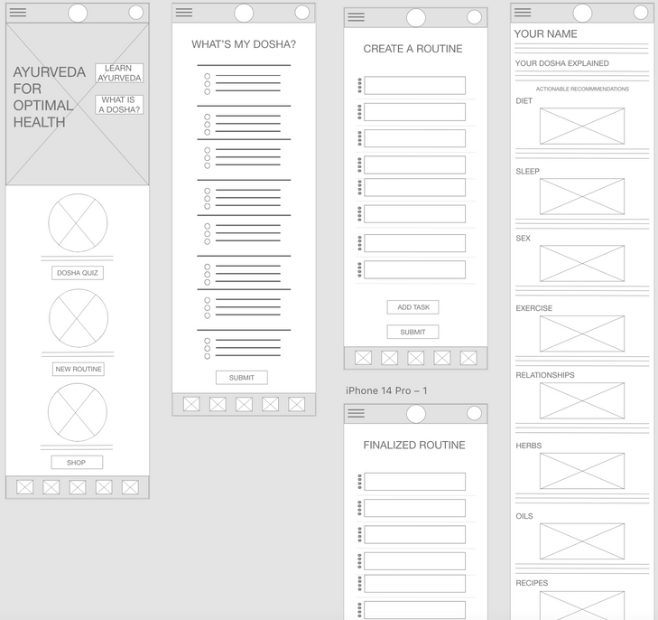
What's My Dosha? needed an app and responsive website to promote Ayurvedic wellness. The goal was to help users discover more about their health through a "dosha quiz" and provide actionalble recommendations that prompt users to shop for holistic remedies.
The Project
Project Duration
June 2023-July 2023
USER PERSONAS
"I don't have time to workout or eat healthy!"
"I want to be healthy, balanced, motivated and consistent but I always seem to fall back in my ways."
KEEARA
Age: 29
Education: Bachelor's Degree
Hometown: Houston, TX
Family: Single, 1 son
Occupation: Insurance Adjuster
KEYONA
Age: 32
Education: Master's Degree
Hometown: Miami, Fl
Family: Single, 1 son
Occupation: Psychologist
GOALS
GOALS
Learn how to balance life and manage anxiety
Doesn't know where to start with health and wellness
Tried many things and reverted to old patterns
Spend more time with her son
Create a happy and healthy life
Get married and have more children
FRUSTRATIONS
FRUSTRATIONS
Doesn't know if school is for her
Art school is expensive
Family is not financially able to help her succeed
Bad relationships
Working too much
Still living with her parents
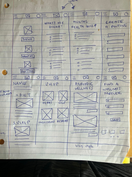
Sketches
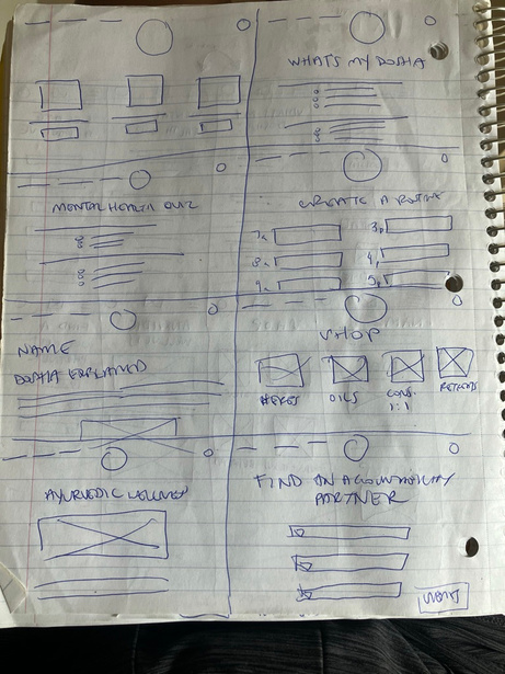
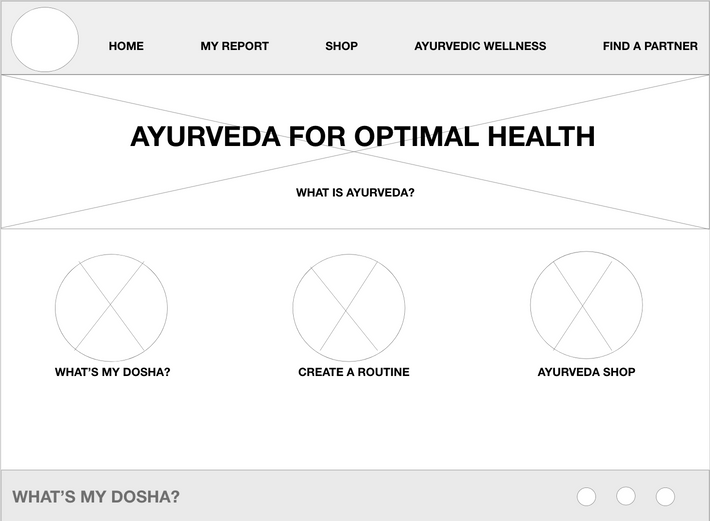
Wireframes


SOLVING USER PAIN POINTS
Since Ayurveda is not widely known in the Western world, I used descriptive headers for easy navigation and a CTA, "What is Ayurveda" to learn more before diving in to the quiz and results.
If you group your elements together they'll stay together in mobile view
Almost done!
Descriptive headers to help guide the process
CTA to allow users to learn more about Ayurveda as a health concept
USABILITY STUDY FINDINGS
01
Easy Call-To-Action
Users want to use images and buttons to navigate through app, they want CTAs to be visible without searching for them.
02
Text & Images
Users would prefer not to read, but instead to see icons or images to represent CTA or message. Users can benefit from larger text and images.
03
Variety
Users like to navigate the app in their own way, prefer variety in how they get to and from an action.
MAIN USER FLOW
ACCESSIBILITY CONSIDERATIONS
01
Images, Iconography
I spoke with an older user who needs reading glasses. Her major concern was the size of the text so I made most of it larger.
02
Descriptive Headers
Using off white and black with a hint of gold, the app is considering accessibility for visually impaired individuals and everyone in need of very clear CTA’s.
03
Variety of Color
Some users were not very fond of reading or looking for things. This accessibility consideration benefits users who are not proficient in reading, or who choose to be less active for social media.
TAKEAWAYS
1
Impact:
What's My Dosha? has an app and responsive website that helps users learn more about their health through a "dosha quiz", allowing users to shop from actionalble recommendations and easily manage their health through Ayurveda
2
3
User Quote:
”This is a pretty cool concept. More people need to manage their health.”
What I learned:
While creating the What’s My Dosha website, I realized that I need to find better assets to incorporate into a variety of projects I may be faced with.
Let's Connect
We hope you love the experience as as
much as we've loved creating it.
KENYA HADNOT
hadnotkenya@gmail.com
